FM: Where do you live? What is it like there? How is it different to Nevada?
JB: I live in Beacon, NY. It is a medium size town that sits in a valley between the Hudson River and Mount Beacon (~1500 feet). Beautiful spot and while it is an hour plus north of New York City, you definitely feel the city’s influence. Having the DIA museum here puts Beacon on the map for city folk.
Being in a valley is very different from the open vistas you get in Nevada. The ecology is also vastly different but one odd similarity I learned during my dyeing endeavors is that mugwort — a plant that grows everywhere including in ditches alongside roads is in the same family (Artemisia) as your sagebrush. They yield the same beautiful yellow dye as well.
FM: When did response to place enter into your work?
JB: Growing up our family vacations were always hiking, canoeing or camping either in the Pine Barrens, NJ or the white mountains in Vermont. These outings were formative. And maybe that’s why environmental issues and the natural world have, maybe always, figured in my orientation. I was the kid collecting bayberries in the Pine Barrens to make wax candles and it seems I’m still inclined to have this kind of ‘collaboration’ with plants and place in my making.
FM: How has the Sierra Nevada College MFA-IA program fitted around your life? Why did you choose this program?
JB: The most compelling reasons were the low residency structure and the connection with Sagehen Creek Field Station in Tahoe National Park. I am interested in collaborating with scientists and ecological research and the Field Station offered a tangible way to do that.
The program allowed me to get a degree without having to relocate my children and spouse. It has also motivated me to network and create opportunities here in my area that will endure beyond the degree.
FM: What is one of the most memorable experiences of the program?
JB: The very first residency at Sagehen I tied a rope to my leg which was anchored by a rock and tried to swim upstream in ice cold water. It was a meditation on failure. Maybe, failure to return. I saw the scene as bucolic in a kind of German romanticism way and wanted to both enter and disrupt this. Anyway I did it as a performance. As people came along the footpath they ‘discovered’ me sitting on a log a ways up the stream. I dove in and swam as long as the cold would allow.
Definitely one of the more memorable moments. But there were others! Like filming with Kelly Wallis on the banks of Lake Tahoe in a blizzard…
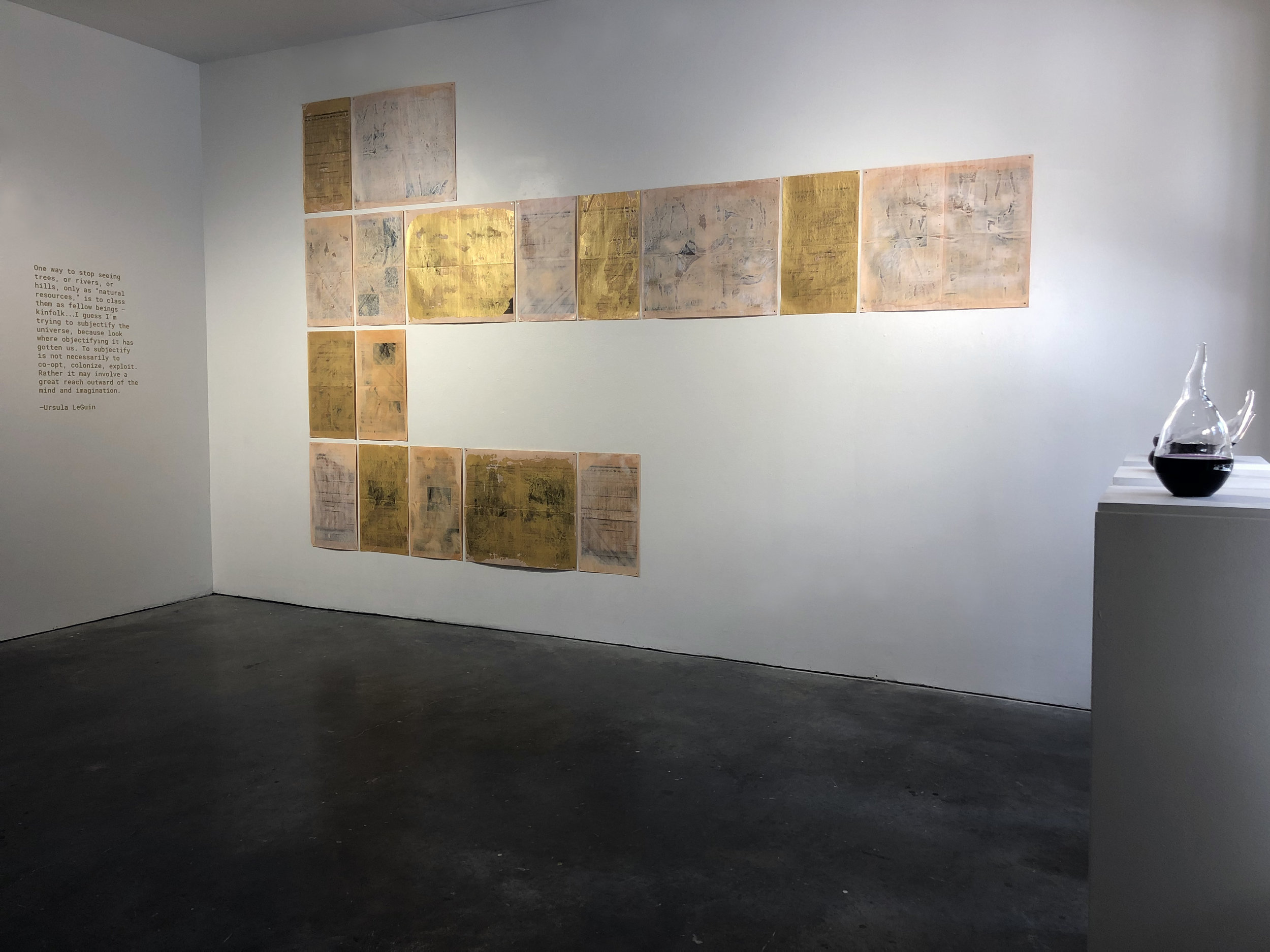
The “kinfolk” quote from Ursula Leguin on the left wall appears to me to be foundational to the way you work, does this apply to everything you do?
I hope so, going forward. I think it’s a wonderful compass. It can be interpreted so many ways and it’s that multiplicity of possibility, or maybe the specific strategies that excite me.
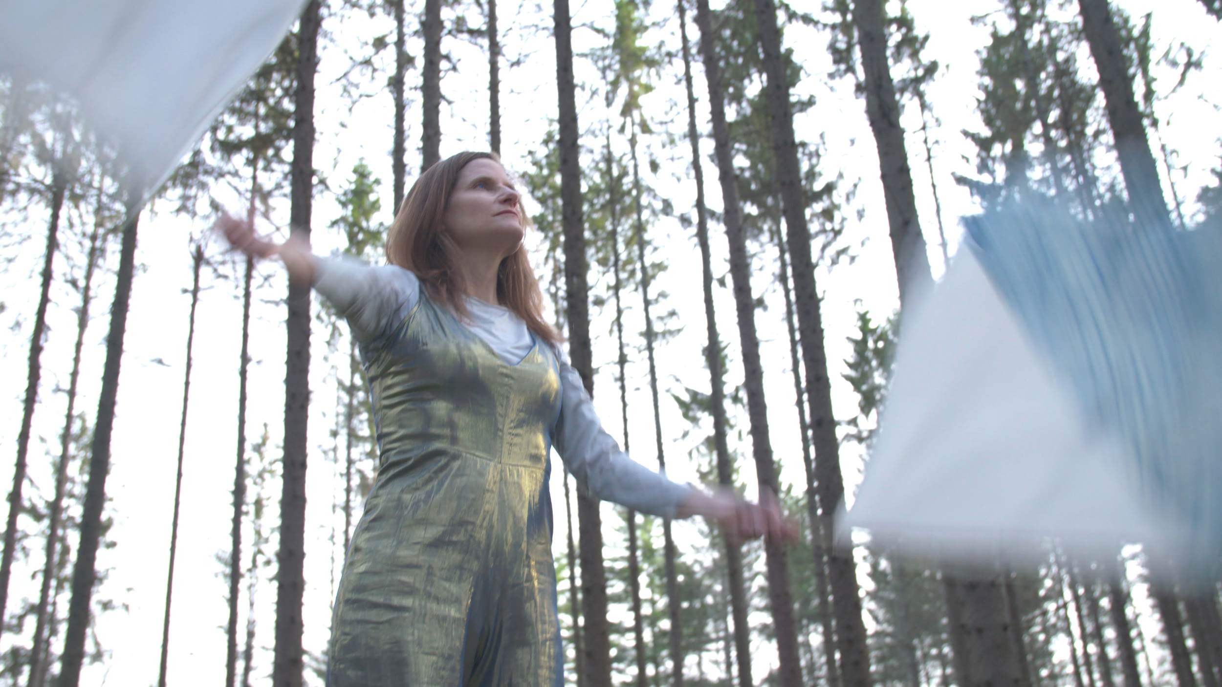
FM: You use sound and performance while interacting with the natural world as integral parts of your work,… Tell me about the genesis of “Performing Vowels in the Note of Blue”
JB: The video, ‘Performing vowels,’ most directly deals with language. The premise of this piece is that meaning is constructed beyond the human world. The patterns found on a jaguar’s fur may signal danger to a prey, in a way that is very different from a zebra’s coat. Movement—sudden or slow, big or small—is a kind of semiotics understood by all beings. Frilled lizards in danger unfurl flaps of skin in their necks to make for a fearsome display, to all but humans who see an Elizabethan collar.
Inspired by my midway project, I Talk to the Wind (that attempted to both perform and extol plant-based models for resiliency through an embodied poetics), I wondered are there examples of human communication that come closer to the way nonhumans, such as plants and animals, communicate? Semaphore flags, developed in 1792, are both a symbolic and indexical sign. A person signals by waving a flag in a particular movement across a landscape or body of water. Each movement denotes a letter—in this case: a, e, I, o, u. These are the symbolic signs or letters people use to form words. However, augmentation of the physical presence of a body (like the frilled lizard), the pattern recognition of color and movement, and the open throated sounds of vowels, all carry meaning in the natural world beyond the coded alphabet. These are indexical signs that can be interpreted by association, in other words through relationship and context. (Semiotics, Pierce)
Vowels are the breath of language. They are a speech sound that is made with no obstruction of the vocal tract—frictionless and continuant, they are open throated. The color blue corresponds to the throat chakra and to truth. In Judaism, vowels are associated with god; in Japan, with the mother.
In this video, I imagine some future form of communication in which the forest plays a role in how we transmit ideas or connect — a ritual of call and response whereby the patterns of movement form the phrases of language. This is not legalese. It is an ambiguous open ended communication based on reciprocity. Failure is understood — perhaps necessary, as it creates openings for alternate interpretations or allows us to imagine the space between.
FM: Does the ephemerality of the performance allude to climate change?
JB: My work avoids commenting on human intervention, as it is a well known fact and often an overly cited or tiresome one. It simply takes up this current reality to consider other ways of being, models of resiliency, interspecies collaboration, etc. that destabilize an anthropocentric view of the natural world. It attempts to add to the conversation on the harrowing reality of climate change with moments of beauty or hope…perhaps in the form of ritual, or experiential metaphors for ecological research.
FM: Your work feels like it always has an alchemical aspect, can you discuss this?
JB: True. I tend to think of it as symbiosis. But I think alchemical does add an interesting and slightly different twist in reading some of the work—like the process of making the dye, the silk scrims wicking dye, the gold wax prints, or even the metallics woven into the outfits for Performing Vowels. You could also say that the performance itself—a collaboration amongst five women—is alchemical. Our movements—like language, like the forest—slip between structure and improvisation. So there was plenty of individual interpretation that each person brought to the moment, the combination of which definitely felt like a magical process of transmutation. Good moment to mention who they are! The performers are Felicia Ballos, Alexa Beckham, Amanda Punsoda, and Elizabeth Castagna, and myself. Rob Featherstone is the cinematographer. And Colorant, a local Beacon clothing shop that works with natural dyes, provided the outfits.
FM: The catalogue smells slightly like Pee …did you use the dye you made to print something in there?
JB: Ha! No.
FM: What is the origin of the dye process that you used?
The dye process is an age old recipe. Before there was ammonia, people would ferment urine for various processes that required a certain pH. I used the Umbilicate mammulata lichen, which yields a deep purple known as ‘orceil.’ To sustainably harvest the lichen, it is best found after a storm when the large leaves fall on the ground. You don’t need much. A cup full of lichen (torn smaller pieces) is placed in a mason jar with 1/2 cup of water and 1/2 cup of ammonia. In some jars I replaced the ammonia and water with fermented urine. (My urine never quite reached the pH level of ammonia so I increased the urine and ditched the water.) You stir vigorously to introduce oxygen. Then cap and shake several times a day for the first week, and once every few days for the next 15 weeks. Part of what drew me to this specific lichen was it’s name. In Latin, Umbilicate refers to the naval, hence umbilical chord. While mammulata refers to an udder or breast.
Reference: Casselman, KD. Lichen Dyes: the New Source Book. Dover Publications, 1999
FM: Did you hand blow the stomach shaped glass vessels… what is your thought process behind this? (I thought it was wine and sniffed it)
The glass vessels are flame work, not hand blown. I collaborated with glass artist, Daniel Spitzer, to make those. I knew I needed a glass vessel in order to share the liquid form of the dye. This felt important — to not just show the results on fabric, but to have the fermenting dye itself present in the space. Since I had used my own urine to make the dye, I wanted the notion of body in the glass form. My sketches were of stomachs and kidneys. And like internal organs, the forms needed to be delicate and vulnerable. I shared them with Dan and he was game so we got together a few times and played! It was really thrilling to see the vessels come alive.
Others mentioned it looked like wine! How did they smell by the time you got there? They were still a bit pungent when I installed.
FM: Fairly potent still….Tell me about the golden newspaper installation…
JB: The title of the piece is ‘All flourishing is mutual’ — a quote from Robin Wall Kimmerer’s book ‘Braiding Sweetgrass’ She is referring to interspecies dependency. The work is a critique of capitalism, accumulation, and the way we treat earth’s natural resources as commodity.
The prints are encaustic wax on The Financial Times newspaper which is this lovely peachy pink color and most of it’s pages are filled with numbers from the stock exchange or marketplace news. The wax printing is a kind of accumulation, and simultaneously obliteration, of the newspaper.
I created a system for the letters of the quote: gold wax for vowels, peachy pink for consonants. A spread (double sheet) for two letters that make one sound — digraphs and diphthongs. And, a single sheet for single letters. They were hung as letters in a sentence (think wheel of fortune;)
My work is concerned in part with language and communication. Newspapers are a form of communication.
FM: Can you talk about your use of precious and mundane materials and how those choices are made?
JB: It’s true that the materiality of silk communicates preciousness, the thin glass vessels, etc. and clearly that’s where my aesthetic preferences lie. For me these qualities of transparency and layering recall the atmospheric, a recurring theme in my work. But within this, I mix earthly aspects like bodily fluids. Similarly, the newspapers as a cultural artifact counter the softness of the textiles, but even their final form of wax encasement and gold feel somewhat precious—perhaps an alchemical transformation from mundane to precious? I like to think that the language—in the form of the catalogue, titles, and general framing—is a nice counter point to the ethereal nature of the work, with its clarity and sharpness.
FM: Jean thank you so much for talking with me about your work, creative process and the SNC MFA-IA program, just one final question….what are you working on now?
JB: Applications! For work, residencies, and grants. Thinking about next steps for ‘Performing vowels’ — perhaps as a public engagement. And, applying with Rachel Zollinger to do a color study / research / art project together.
And returning to teach three classes this semester at Pratt. I’m teaching a new class called Emerging Practices on the theme of governance, design objects and visual language. So that’s all keeping me busy at the moment.
**************************
You can follow Jean Brennan on Instagram and see more of her beautiful work on her website
Interview by Frances Melhop


